This is the seventh scrapbook page for my new weekly post Scrap Thursday. I will try and bring new ideas and techniques and revisit old favourites too. If you have any suggestions or requests just let me know and I will do my best to accommodate these.
This week my hubby and I celebrated our 24th wedding anniversary and I felt it only fitting to show a wedding day layout today!
I was inspired by Ken Oliver over at World in Progress, check out his blog and Facebook page for more inspiration.
Products used: Ken Oliver WaterColour Memories card stock, Bazzill, embroidery thread, beads, shrink plastic, stamps, Sizzix dies, Idea-ology, flower with leaf and butterfly embellishments.
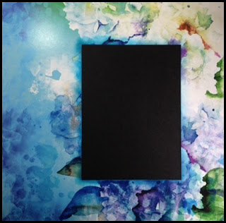
I marked out where I wanted my photograph to sit on the muted side of the card. I left a 5mm gap around the photograph.
Using a craft knife I cut out the rectangle and kept it to one side to use later.
I inked around the cut edges using the new colour Distress Ink pads.
I cut black Bazzill to mount the photograph on.
Using white shrink plastic, stamps and a Sizzix die I made the corner banner.
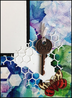
I used the Alterations Honeycomb die and card I had earlier put to one side.
Using white card and the Holtz Mixed Media die, I cut out some additional embellishments to add to the layout.
I added an Idea-ology key and a butterfly to the corner.
I cut out a tag, inked the edges and with embroidery thread I stitched around the edges, I added beads, ribbon, a leaf and flower to the top and stuck in place ready for journaling.
I was inspired by Ken Oliver over at World in Progress, check out his blog and Facebook page for more inspiration.
Products used: Ken Oliver WaterColour Memories card stock, Bazzill, embroidery thread, beads, shrink plastic, stamps, Sizzix dies, Idea-ology, flower with leaf and butterfly embellishments.
Below are the pictorial steps I took to make this layout,
if you have any questions please ask.
The WaterColour Memories card is fabulous not only because of the designs but also the quality and weight of the card is really very good and the design appears on both sides with one side in full colour and one side in muted colours.I marked out where I wanted my photograph to sit on the muted side of the card. I left a 5mm gap around the photograph.
Using a craft knife I cut out the rectangle and kept it to one side to use later.
I inked around the cut edges using the new colour Distress Ink pads.
I cut black Bazzill to mount the photograph on.
Using white shrink plastic, stamps and a Sizzix die I made the corner banner.
I used the Alterations Honeycomb die and card I had earlier put to one side.
Using white card and the Holtz Mixed Media die, I cut out some additional embellishments to add to the layout.
I added an Idea-ology key and a butterfly to the corner.
I cut out a tag, inked the edges and with embroidery thread I stitched around the edges, I added beads, ribbon, a leaf and flower to the top and stuck in place ready for journaling.


No comments:
Post a Comment